Wednesday, September 29, 2010
Painted kitchen window
Tuesday, September 28, 2010
Autumn Giveaway WINNER!!!
First of all, thank you to all who entered our giveaway! :)
And we have a winner!
Congratulations to Before the Dawn,
Before The Dawn said...
And thanks again to everyone who participated! :)

Sunday, September 26, 2010
Fall In Focus
Friday, September 17, 2010
In the living room (again)
{Just a little reminder that if you haven't entered our Autumn giveaway, there's still time! Click here for details.}
So I hauled out a lot of the decorations and some of the furniture so you could more easily see the room itself. Because the walls were just painted there were no curtains or wall hangings to move, so this wasn't so hard. I finally decided I'm going to keep the "simply white" I painted the walls. I think it's the right color. :)
Warning: I am showing several pictures, to give you an idea of the room's layout. This is the part of the room you have seen so far, in my fireplace post:
We will now move on to the even less attractive...
( I am working myself up to revealing the most absolutely horrid side of this room.)

I have plans for a farmhouse table that will look similar to this one in the picture below (minus the red chairs). However, I am probably going to have to make it. The ones I am seeing are so expensive! I am thinking a "plank boards" look for the top of mine would be good, but I love the legs of this table and the contrast of the white with the wood top!
Now taking a deep breath and summoning all fortitude, I add this picture for you to see:
 (I'm wincing a little.)
I am hoping to take it from the way it is now to a little like this:


But for the living room, I picture this floor...

(by the way, do you see the cute little "bin" cupboards in this picture? I think it's love.)


I like this lamp shade (found at IKEA) but think I will only use one of these lamp shades. Otherwise, the room might look too modern for my taste!
{Before closing, I want to say thank you to Mari Eriksson for kindly lending me her pictures for this post! Her photography is simply amazing! I have so much enjoyed looking at her website, Mari Eriksson Photography! And she has a blog, An angel at my table,
that is beyond beautiful! When you see it, you will know exactly what I mean! It makes me want to see Sweden for myself!}
But for now, I will just be content to bring a little of Sweden here to my home, in the soft whites and grays I have come to love...
Well, I hope you all have a beautiful weekend, and thanks for stopping by for a visit! :)
Blessings~
Jenni
Monday, September 13, 2010
Autumn giveaway
Hi everyone! I hope you all had a wonderful weekend! :)
Well, it is time for another giveaway here at Beautiful Nest! We thought an Autumn theme would be fun! The season brings with it so many fun traditions and holidays! :)
And to help you get into a festive mood, there is nothing quite like a Gooseberry Patch cookbook! They always have the best recipes!
A peek at a few pages from it...
I love how this cookbook not only shares recipes great for fall, but also for the other seasons, too!
Also included in this giveaway are:
A painted pumpkin decoration~

And just for fun~ a box of dip mix, just perfect for watching football games on TV, and some candy corn, of course!
To enter this giveaway, just leave a comment! You do not need to have a blog, just please make sure to leave an email address where we can contact you if you win! :)
Now if you would like extra entries:
For one extra entry, become a follower of this blog...
For another entry, post about this on your blog!
Please leave a comment for each thing you do, so we can make sure your name gets added for each thing! :)
{And if you want the chance to win yet ANOTHER giveaway, I am also holding one over at my other blog, Nest to Keep, starting today also! To check this "Kitchen" themed giveaway out, click here! ~Sparrow}
This giveaway, as well as the one at Nest to Keep, will run until Monday, September 24, 11:59 PST.
Thank you for stopping by and have a wonderful night!
Blessings,

Sunday, September 12, 2010
The Chalkboard Pantry Doors
Last summer (2009) I found this picture
at Better Homes and Gardens, while searching for kitchen inspiration pictures. Of course, I must admit to wishing my pantry was as big as this, but it is what it is! It doesn't mean, however, that it has to be either ugly or boring! ;)
(Which it was.)
Here is a "before" picture of our pantry doors. I actually finished the doors last February, and posted on them at my other blog, Nest to Keep. BUT, I learned something important:
If you use green chalk, and then, while trying to clean it off, smear it on the white trim, it makes the trim green. Permanently.
So being the perfectionist I am, I repainted them. So here they are, "take two"!
There is a "grooved" design around the edges of the cabinet, which separated the chalkboard from the "trim" around the outer part, which I painted white. It is really difficult to make a clean, crisp edge between the two colors.
But that's where this came in:
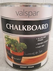
Have you seen these paint pens you can buy?
They saved my life. Practically.
I used the black, medium tipped ones and they were able to make a clean line dividing the chalkboard paint from the white part. (It was a lot harder to do with the doors already hung up. It was a cleaner and crisper line the first time around when I painted them while they were laid flat on a table, but I eventually just had to call it "good enough".)
And then I hid all the green chalk.
Here below is a better picture of the doors, although I don't think it's the best picture of the kitchen itself! You can see all I am still working on, including the crown molding! And our very ugly stove to the left of the pantry...but the good news is my husband is just about to start rewiring our "new" vintage stove we will be installing! (Hopefully this fall, if everything goes well!)
Oh, and yes, I changed my mind about the bead board on the back of the upper cabinets...
(Again.)
I am repainting them white, and I love it so far! It feels so much cleaner and open!
I am linking this to:
Well, that is all for me for now! I sure do hope you all had a fantastic weekend! Thank you for taking the time to stop by!
Blessings,
Sparrow
Saturday, September 11, 2010
Starbucks pumpkin scones
Have you ever tried the pumpkin scones at Starbucks? I didn't even know about them until a couple of years ago, but once I had one for myself, I was done for.
(They are just that heavenly.)
Of course, I immediately googled "pumpkin scones" hoping to find a good recipe! I found this one at Food.com (formerly Recipezaar), and it is meant to be an imitation of the Starbucks version, but is way better! In fact, recently I tried one from Starbucks, and was disappointed. It was as hard as a rock! Maybe they were just having an off day...either way, this is the best pumpkin scone recipe!
So this is my wording, but it is the same recipe.
Starbucks Pumpkin Scones
2 cups flour
7 tablespoons granulated sugar
1 tablespoon baking powder
1/2 teaspoon salt
1/2 teaspoon cinnamon
1/2 teaspoon nutmeg
1/4 teaspoon ground cloves
1/4 teaspoon ground ginger
6 tablespoon cold butter
1 egg
3 tablespoons half and half
1/2 cup canned pumpkin
Glaze:
1 cup powdered sugar
1 tsp. powdered sugar
2 tablespoons whole milk
Spiced Glaze:
1 cup powdered sugar
3 teaspoons powdered sugar
1/4 teaspoon cinnamon
1/8 teaspoon nutmeg
pinch cloves
pinch ginger
2 Tbsp. whole milk
Preheat oven to 425 degrees F. and grease baking sheet or cover with parchment paper.
In a bowl, mix together all dry ingredients. Blend in cold butter with a fork or pastry cutter. In another bowl, whisk egg, half and half,and pumpkin.
Add pumpkin mixture to dry ingredients and combine, just until mixed.
Put onto lightly floured surface and gently pat into a 10 inch circle. Cut into 8 wedges. (The recipe said to pat it into a rectangle and make six scones, but I prefer 8 less enormous scones!)
Put onto prepared baking sheet, and bake for 10-11 minutes.
After they cool for a bit, frost with glaze with a pastry brush. As that glaze sets, drizzle spiced glaze on top next, if desired. (I only use the first glaze~ just personal preference.) You can use a whisk for this thicker glaze or even a spoon to make glazed "zigzags" over the scones. Wait for at least one hour before eating if using spiced glaze, for the icing to set.
(Recipe submitted by Rachel Snachel.)
Eat and enjoy!
I hope you all are having a great weekend! Thank you so much for stopping by, and have a wonderful night!
Blessings,
Jenni


.jpg)


